I was really excited when the promo pictures for these came out. I like mattes. I like brights. I like darks. Triple crown, right?
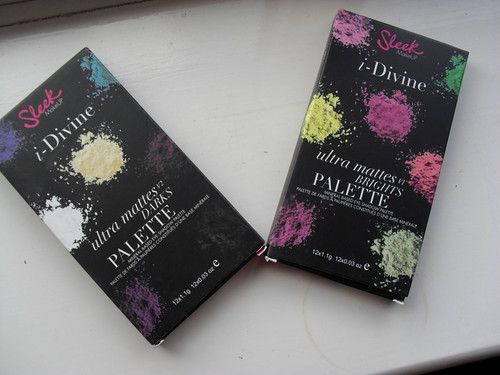
Sort of. I like mattes, brights, and darks, but I'm not too keen on Sleek mattes. Historically, they've been incredibly hit and miss for me - even the standard black colour that's included with pretty much every palette ever varies in pigmentation from palette to palette (for example, the one included with my Acid palette is pretty pathetic, but the one in my Circus palette is blacker than your average collapsed megastar). The Bohemian palette is full of mattes with fantastic colour payoff, whereas the Chaos palette, an all matte one, won't give you payoff even if you take a chainsaw to it. This inconsistency is present in almost every palette I own by them, and countless reviews on this here blog of mine attest to that. So I was quite cautious when I decided to invest in these.
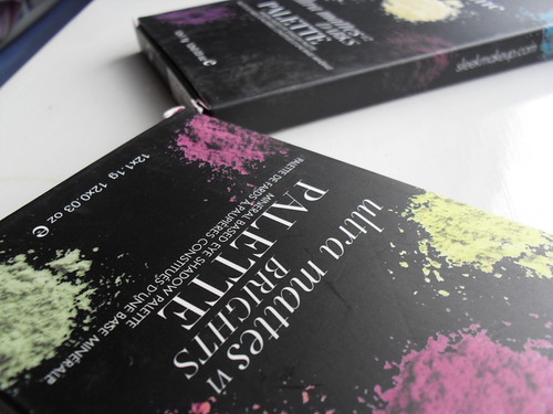
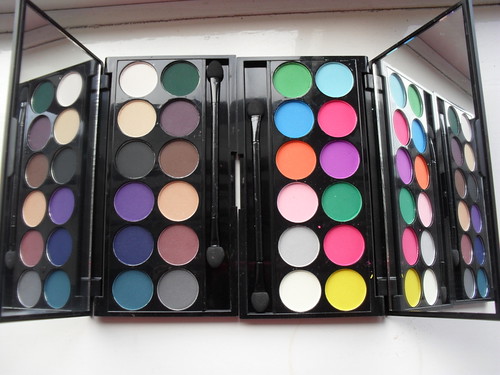
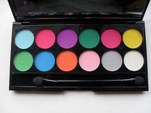
As you can see, they look absolutely stunning in the pan.
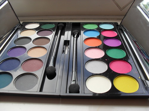
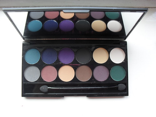
I'm enjoying the colour choices for the Dark palette. Most of the colours are thoroughly useable, and I have a thing for dark blue/teal/green eyeshadows of which there are plenty here.
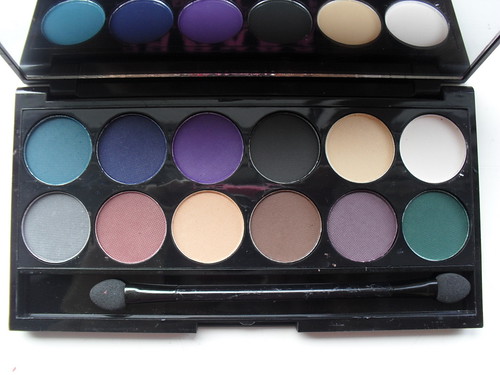
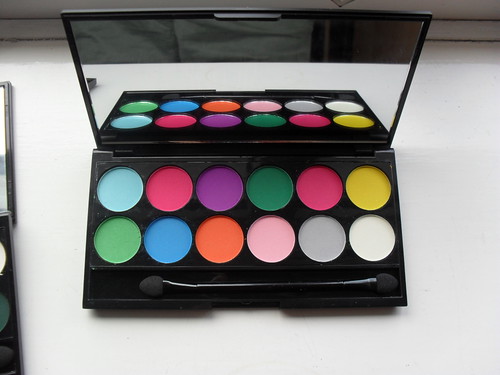
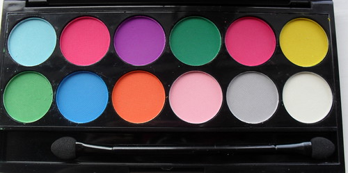
Again, I appreciate the colour choices for the Brights palette, though I feel a red wouldn't have gone amiss somewhere here, and the pinks are slightly too similar for my liking. Still, a good effort.
The Darks colours are fine when swatched - less fallout than other Sleek shades I own (I'm handing that to the removal of the waffle thatched pattern from the Sleek eyeshadows, now they resemble the MUA ones) and on the whole, good pigmentation. A couple of shades disappointed me, the white and the grey, but as I wouldn't get a lot of use out of those anyway I'm not going to cry over it.
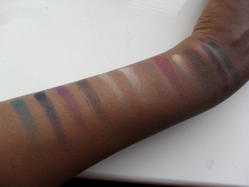
With flash:
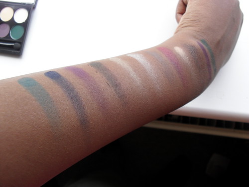
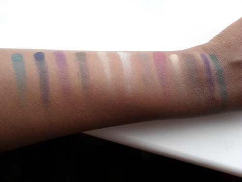
The pigmentation of the greens and the lightish brown are especially good, and this transfers to an ease of use on the eyes, as well. Good job!
Unfortunately, it all comes apart here for the Brights palette. Booooo.
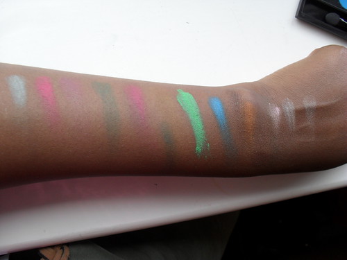
Why do I have one stupidly bright green and a collection of substandard other colours? All the lighter shades are pants, the yellow is about as visible as air, the purple is piss poor and the light blue resembles flour. Judging you, Sleek. Tempted to get a refund...the only colours worth using are the green, the turquoise colour, the orange and the slightly brighter pink. Waste of £7.
Conclusion: Darks = good and bang on trend. Brights = buy some chalk instead, it's x10 more effective.
The Student's Guide To Nail Polish
So much makeup. Such little student finance. A fight against the draconian makeup policies of a Catholic school. (2013)
Sleek MakeUP i-Divine Ultra Mattes Palettes vs Darks and Brights
Posted by
The Student's Guide To Nail Polish
on Wednesday, October 03, 2012
Powered by Blogger.

Hahaha-buy some chalk instead-haha-LOVE your sense of humour!
ReplyDeleteI have one Sleek Palette I picked up in London on holiday last year and honestly I just don't reach for it at all. I find sometimes they stick in a weird colour choice in their palettes too.
Haha, thanks Tracy! I'm sorry, but the first time I swatched these I had genuinely considered whether a bumper pack would be a better investment :P
ReplyDeleteSleek can be a bit odd with their colours, though they're getting better. I have the Sunset palette (has absolutely no pigmentation issues, though) which is all golds, browns, reds and coppers, with a whacking bright blue in the corner! Odd people, Sleek :P Thank you for commenting!