Archive for October 2012

MUA 'Undressed' Palette Swatches, Review

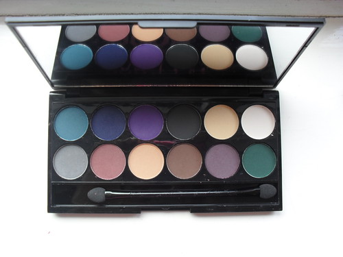
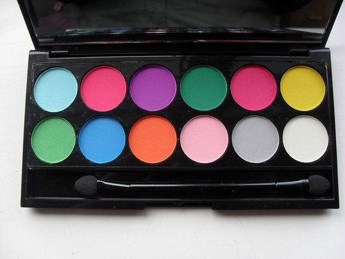
MUA are probably one of the most prolific beauty brands at the moment (certainly of the budget persuasion.) It feels like every week, a new product is being released. I like it. It keeps the brand fresh in the minds of beauty bloggers/consumers in general, but without feeling tired. Plus, they're scoring hits rather than misses. Take this palette:

SAM_1541
SAM_1543
SAM_1544

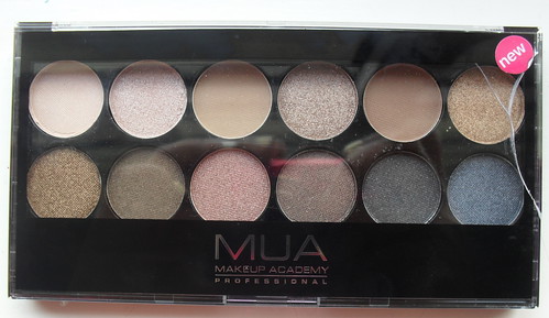
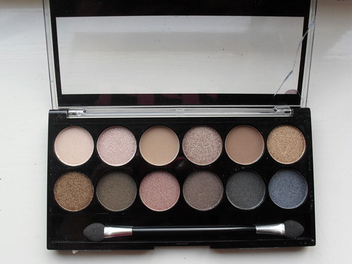
I personally prefer this to 'Heaven and Earth', as it feels a little less samey due to the greater variation in colour shades. It still only has one matte, but matte eyeshadows aren't really MUA's strength so I'm not disappointed. At the very least, the fact that MUA possesses not one, but TWO Urban Decay 'Naked' palette dupes in it's line up shows that it sure as hell knows what it's target audience want.
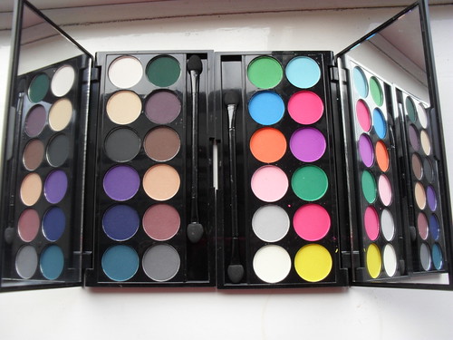
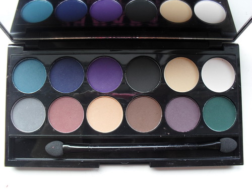
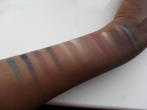
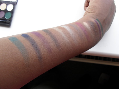
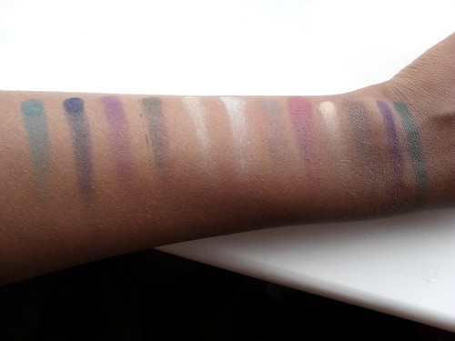
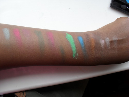
Swatches:
SAM_1547
SAM_1548

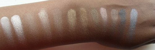
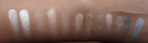
The light brown matte shade (third swatch in from the left) performed better than expectations! If MUA can keep up that sort of formula for future releases, their palettes will officially be on par with Sleek's. Unfortunately, given the horrible matte textures in 'Immaculate Collection' and 'Pretty Pastels' and pretty much MUA palette that I've owned ever, I suspect that the buttery softness of this particular shadow is a one off.
SAM_1551

I think this palette will suit a pretty large range of skin tones, and it really is easy to work with. My criticisms would be that the packaging is quite easily damaged (see the very first picture) and that the absence of a matte black means that my shading options are a little limited if I were using soley this palette, but thats a personal preference. Not everyone likes to darken their crease with a little black shadow, that's just me.

For £4, (but with MUA being constantly on promotion either in-store at Superdrug or on it's website, you may well find it cheaper) I think this is a seriously solid addition to my makeup collection.

Who else has this palette?

Sleek MakeUP i-Divine Ultra Mattes Palettes vs Darks and Brights

I was really excited when the promo pictures for these came out. I like mattes. I like brights. I like darks. Triple crown, right?

SAM_1561

Sort of. I like mattes, brights, and darks, but I'm not too keen on Sleek mattes. Historically, they've been incredibly hit and miss for me - even the standard black colour that's included with pretty much every palette ever varies in pigmentation from palette to palette (for example, the one included with my Acid palette is pretty pathetic, but the one in my Circus palette is blacker than your average collapsed megastar). The Bohemian palette is full of mattes with fantastic colour payoff, whereas the Chaos palette, an all matte one, won't give you payoff even if you take a chainsaw to it. This inconsistency is present in almost every palette I own by them, and countless reviews on this here blog of mine attest to that. So I was quite cautious when I decided to invest in these.

SAM_1564
SAM_1566

As you can see, they look absolutely stunning in the pan.
SAM_1567
SAM_1570
I'm enjoying the colour choices for the Dark palette. Most of the colours are thoroughly useable, and I have a thing for dark blue/teal/green eyeshadows of which there are plenty here.

SAM_1571

SAM_1573SAM_1576

Again, I appreciate the colour choices for the Brights palette, though I feel a red wouldn't have gone amiss somewhere here, and the pinks are slightly too similar for my liking. Still, a good effort.

SAM_1577

The Darks colours are fine when swatched - less fallout than other Sleek shades I own (I'm handing that to the removal of the waffle thatched pattern from the Sleek eyeshadows, now they resemble the MUA ones) and on the whole, good pigmentation. A couple of shades disappointed me, the white and the grey, but as I wouldn't get a lot of use out of those anyway I'm not going to cry over it.

SAM_1578

With flash:
SAM_1581
SAM_1582

The pigmentation of the greens and the lightish brown are especially good, and this transfers to an ease of use on the eyes, as well. Good job!

Unfortunately, it all comes apart here for the Brights palette. Booooo.
SAM_1585

Why do I have one stupidly bright green and a collection of substandard other colours? All the lighter shades are pants, the yellow is about as visible as air, the purple is piss poor and the light blue resembles flour. Judging you, Sleek. Tempted to get a refund...the only colours worth using are the green, the turquoise colour, the orange and the slightly brighter pink. Waste of £7.

Conclusion: Darks = good and bang on trend. Brights = buy some chalk instead, it's x10 more effective.

Powered by Blogger.

Living Legends